本帖最后由 丁克一族 于 2019-7-26 09:26 编辑
该项目是为啤酒品牌Brouwerij ‘t IJ最新设计的酒吧餐厅,位于阿姆斯特丹最具活力的Vondelpark公园内。酒吧所在的建筑原本作为茶室使用,在Studio Modijefsky的精心设计下,这处具有历史价值的空间被赋予了现代化的功能。 In the heart of the most vibrant and well-known park in Amsterdam: the Vondelpark, Brouwerij ‘t IJ has adapted a unique monument as its latest taproom. An instantly recognisable former tearoom – Blauwe Theehuis – was carefully redesigned by Studio Modijefsky, who has mastered the tricky art of playing homage to a historic property while keeping it contemporary and fresh. 建筑原有的结构被保留下来,包括钢和玻璃构成的主框架、锌质的细部以及花岗岩地板,并且对原先的蓝白配色以更加大胆的方式进行了运用。室内空间主要采用了受欢迎的经典现代主义材料,例如混凝土、玻璃和钢材等,主要体现在吧台墙、玻璃杯架、扶手和家具上。从整体上看,这些元素共同为温暖的黄铜细部以及由Studio Molen设计的青铜雕塑提供了适宜的背景。 The original bones of the building – steel glass frames, zinc details, granite flooring- all feature strongly in the interior design. The white and blue original colour palette dictated by the monument status of the building remains the same, reused in a more daring way. Classic modernist materials beloved by the Nieuwe Bouwen movement, such as: concrete, glass and steel, are used to create interior elements including the back bar, glass rack, railings and furniture. Collectively, they all form a handsome backdrop for the light modern interventions of warmer brass details, specially sourced furniture and a bronze sculpture made by Studio Molen.
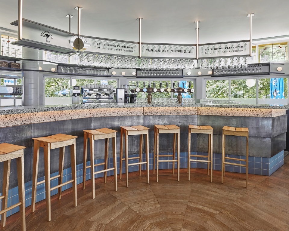
建筑的空间概念以一个独特的十二边形平面为基础,每个角落(共四个角)都设有三个呈锐角的入口。一层空间的木制吧台保持了与立面相同的轮廓,使顾客从任意一个入口进入酒吧时都会感受到友好的欢迎氛围。吧台上方的玻璃杯架由精致的花纹玻璃制成,上面手绘有每种啤酒的名称。轻盈的钢架连接了三个实心的支撑柱,并在交汇处形成一个折叠的鸵鸟蛋的形状——这也是Brouwerij ’t IJ品牌的标志形象。 The spatial concept of the building is based around the unique, dodecagonal shape of the floorplan, with three sharp-angled entrances placed in each one out of the four corners. On the ground floor the wooden front bar follows the symmetrical lines of the façade, facing all entrances simultaneously, welcoming customers arriving from all directions. Above the bar, a refined textured glass rack with hand painted beer names connects three solid supporting columns, the rack’s subtle steel details come together to create a folding ostrich egg- the iconic symbol of Brouwerij ’t IJ.
▼从室外望向吧台,view to the bar from outside
▼首层的木制吧台保持了与立面相同的轮廓,the wooden front bar on the ground floor follows the symmetrical lines of the façade
▼钢架在交汇处形成一个折叠的鸵鸟蛋的形状, the rack’s subtle steel details come together to create a folding ostrich egg
▼花纹玻璃上面手绘有每种啤酒的名称, a refined textured glass rack with hand painted beer names
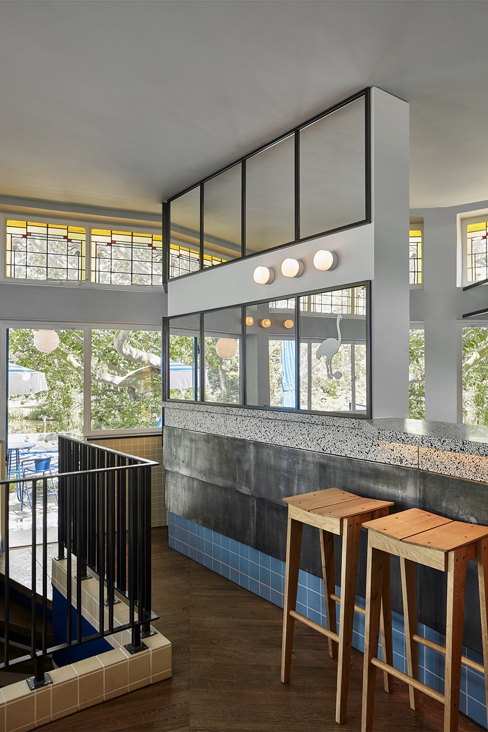
建筑的二层是一个带有屋顶露台的小型用餐空间,整体以玻璃围合,可以欣赏到附近树木和池塘的风景。该空间使用了与一层相同的材料,但运用的方式却很不一样:首层地面铺设的水磨石在二楼被用作吧台台面,与做旧的锌板和蓝色的格子瓷砖贴面形成搭配。吧台的形状以后墙的轮廓为基准,方便为室内留出更多的空间。
Upstairs there is a small restaurant room with a rooftop terrace. The space is fully glazed, allowing customers to enjoy panoramic views of the surrounding trees and ponds, turning this tiny venue into a calming green oasis. The bar is made of the materials that appear downstairs, applied in a different way: terrazzo previously used as floor finish forms the bar top, aged zinc plates and blue square tiles clad the bar front. The shape of the bar this time follows the lines of the back wall of the building, giving up more space to the interior. ▼室内细部,interior detailed view
建筑原有的结构被保留下来,包括钢和玻璃构成的主框架、锌质的细部以及花岗岩地板,并且对原先的蓝白配色以更加大胆的方式进行了运用。室内空间主要采用了受欢迎的经典现代主义材料,例如混凝土、玻璃和钢材等,主要体现在吧台墙、玻璃杯架、扶手和家具上。从整体上看,这些元素共同为温暖的黄铜细部以及由Studio Molen设计的青铜雕塑提供了适宜的背景。 The original bones of the building – steel glass frames, zinc details, granite flooring- all feature strongly in the interior design. The white and blue original colour palette dictated by the monument status of the building remains the same, reused in a more daring way. Classic modernist materials beloved by the Nieuwe Bouwen movement, such as: concrete, glass and steel, are used to create interior elements including the back bar, glass rack, railings and furniture. Collectively, they all form a handsome backdrop for the light modern interventions of warmer brass details, specially sourced furniture and a bronze sculpture made by Studio Molen.
建筑的空间概念以一个独特的十二边形平面为基础,每个角落(共四个角)都设有三个呈锐角的入口。一层空间的木制吧台保持了与立面相同的轮廓,使顾客从任意一个入口进入酒吧时都会感受到友好的欢迎氛围。吧台上方的玻璃杯架由精致的花纹玻璃制成,上面手绘有每种啤酒的名称。轻盈的钢架连接了三个实心的支撑柱,并在交汇处形成一个折叠的鸵鸟蛋的形状——这也是Brouwerij ’t IJ品牌的标志形象。 The spatial concept of the building is based around the unique, dodecagonal shape of the floorplan, with three sharp-angled entrances placed in each one out of the four corners. On the ground floor the wooden front bar follows the symmetrical lines of the façade, facing all entrances simultaneously, welcoming customers arriving from all directions. Above the bar, a refined textured glass rack with hand painted beer names connects three solid supporting columns, the rack’s subtle steel details come together to create a folding ostrich egg- the iconic symbol of Brouwerij ’t IJ.
▼从室外望向吧台,view to the bar from outside
▼首层的木制吧台保持了与立面相同的轮廓,the wooden front bar on the ground floor follows the symmetrical lines of the façade ▼钢架在交汇处形成一个折叠的鸵鸟蛋的形状, the rack’s subtle steel details come together to create a folding ostrich egg ▼花纹玻璃上面手绘有每种啤酒的名称, a refined textured glass rack with hand painted beer names 建筑的二层是一个带有屋顶露台的小型用餐空间,整体以玻璃围合,可以欣赏到附近树木和池塘的风景。该空间使用了与一层相同的材料,但运用的方式却很不一样:首层地面铺设的水磨石在二楼被用作吧台台面,与做旧的锌板和蓝色的格子瓷砖贴面形成搭配。吧台的形状以后墙的轮廓为基准,方便为室内留出更多的空间。
Upstairs there is a small restaurant room with a rooftop terrace. The space is fully glazed, allowing customers to enjoy panoramic views of the surrounding trees and ponds, turning this tiny venue into a calming green oasis. The bar is made of the materials that appear downstairs, applied in a different way: terrazzo previously used as floor finish forms the bar top, aged zinc plates and blue square tiles clad the bar front. The shape of the bar this time follows the lines of the back wall of the building, giving up more space to the interior.
[url=] [/url] [/url]
▼室内细部,interior detailed view [url=] [/url] [/url] 圆形的空间通过贯穿室内外的圆形壁灯突显出来,形成一种类似于旋转木马的游乐氛围。从公园的角落也可以观察到这处可爱的空间。 Both inside and outside, the circular shape of the upper terrace is accented by round wall lights, adding a playful merry-go-round feeling which can be observed from far away corners of the park. ▼旋转木马般的氛围,a playful merry-go-round feeling
▼球形灯具, spherical luminaires
小小的酒吧外部被超过1000平方米的室外空间环绕。宽阔的场地中布置着各种形式的座位,为酒吧带来四季皆宜的休闲和社交环境。 The small-scale Blauwe Theehuis building is surrounded by an over 1000m2 terrace. All aspects of this enormous space have been designed to foster playfulness, with various seating arrangements creating a versatile environment which can be used throughout all seasons.
▼场地整体鸟瞰,photographic aerial map
Project: Blauwe Theehuis
Location: Amsterdam, The Netherlands
Program: taproom & restaurant
Assignment: interior design
Status: realised June 2019
Size: ground floor: 64,5m2 + terrace: 1265m2 first floor: 59,5m2 + upper terrace: 250,5m2
Client: Brouwerij ‘t IJ, Drie Wijzen uit Oost
Design: Studio Modijefsky; Esther Stam, Moene van Werven, Agnese Pellino, Natalia Nikolopoulou, Zahra Rajaei
Photography: Maarten Willemstein
Photographic aerial map: Marc Faasse
|